<turbo-stream action="append" target="device-list">
  <template>
      <a class="group block" href="/mobile/1188">
  <div class="bg-white dark:bg-[rgb(0,35,20)] rounded-2xl shadow-sm hover:shadow-md dark:shadow-black/30 dark:hover:shadow-black/50 transition-all duration-200 overflow-hidden flex flex-col h-full border border-gray-100 dark:border-green-900/40 hover:border-green-200 dark:hover:border-green-700">


    <!-- Image — non-PNG device photos are hotlinked JPEGs with an opaque
         white studio background baked into the pixels (no transparency to
         blend with a dark tile), so those stay a deliberate light "photo
         mat" in both themes rather than flipping dark and clashing with
         them. PNGs are usually real cutouts with transparency and don't
         have that problem, so they keep the original theme-aware tile. -->
    <div class="relative bg-gray-50 flex items-center justify-center p-4 h-[180px]">
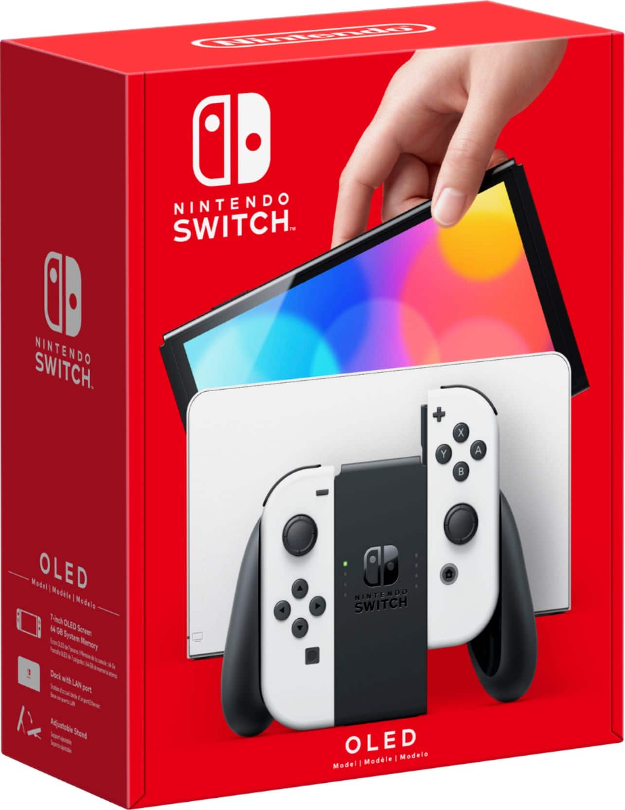
      <img alt="SWITCH OLED" class="h-full object-contain" src="https://pisces.bbystatic.com/image2/BestBuy_US/images/products/6470/6470923_sd.jpg" />
      <img alt="Warranty" class="absolute top-2 left-2 opacity-90" src="/assets/warranty-6f2832a6.png" width="64" height="64" />
    </div>

    <!-- Info -->
    <div class="flex flex-col flex-1 p-4 gap-2">
      <p class="text-[10px] font-semibold text-green-600 dark:text-green-400 uppercase tracking-widest">NINTENDO</p>
      <h3 class="text-sm font-bold text-gray-800 dark:text-white leading-snug line-clamp-2">
        SWITCH OLED 64GB
      </h3>
      <p class="text-xs text-gray-400 dark:text-gray-500">WIFI ONLY</p>

      <!-- Condition badge — a grouped card (show_from) represents several
           storage/grade combinations at once, so showing just this one unit's
           grade would misrepresent the group; the price row alone with
           "From £X" carries the card instead. -->
      <div class="mt-auto pt-2 flex items-center justify-between gap-2">
          <span class="shrink-0 whitespace-nowrap text-[10px] font-semibold px-2 py-0.5 rounded-full bg-indigo-600 text-white">
            Grade A
          </span>
        <div class="flex flex-col items-end">
          <p class="text-base font-extrabold text-gray-900 dark:text-white">£120</p>
        </div>
      </div>

      <!-- Klarna pay-in-3 — its own full-width line so it never squeezes the
           grade badge or pushes the price out of a narrow card. -->
        <p class="text-[10px] leading-tight text-right text-gray-500 dark:text-gray-400">or 3 × £40 with <span class="font-bold text-gray-800 dark:text-gray-200">Klarna</span></p>

      <button class="mt-2 w-full bg-[rgb(0,106,58)] hover:bg-green-700 dark:bg-green-700 dark:hover:bg-green-600 text-white text-xs py-2 font-semibold rounded-xl transition-colors duration-150">
        View Details
      </button>
    </div>
  </div>
</a>
      <a class="group block" href="/mobile/1077">
  <div class="bg-white dark:bg-[rgb(0,35,20)] rounded-2xl shadow-sm hover:shadow-md dark:shadow-black/30 dark:hover:shadow-black/50 transition-all duration-200 overflow-hidden flex flex-col h-full border border-gray-100 dark:border-green-900/40 hover:border-green-200 dark:hover:border-green-700">


    <!-- Image — non-PNG device photos are hotlinked JPEGs with an opaque
         white studio background baked into the pixels (no transparency to
         blend with a dark tile), so those stay a deliberate light "photo
         mat" in both themes rather than flipping dark and clashing with
         them. PNGs are usually real cutouts with transparency and don't
         have that problem, so they keep the original theme-aware tile. -->
    <div class="relative bg-gray-50 flex items-center justify-center p-4 h-[180px]">
      <img alt="3" class="h-full object-contain" src="https://m.media-amazon.com/images/I/61ST5kfuMBL._AC_UF894,1000_QL80_.jpg" />
      <img alt="Warranty" class="absolute top-2 left-2 opacity-90" src="/assets/warranty-6f2832a6.png" width="64" height="64" />
    </div>

    <!-- Info -->
    <div class="flex flex-col flex-1 p-4 gap-2">
      <p class="text-[10px] font-semibold text-green-600 dark:text-green-400 uppercase tracking-widest">META QUEST</p>
      <h3 class="text-sm font-bold text-gray-800 dark:text-white leading-snug line-clamp-2">
        3 128GB
      </h3>
      <p class="text-xs text-gray-400 dark:text-gray-500"></p>

      <!-- Condition badge — a grouped card (show_from) represents several
           storage/grade combinations at once, so showing just this one unit's
           grade would misrepresent the group; the price row alone with
           "From £X" carries the card instead. -->
      <div class="mt-auto pt-2 flex items-center justify-between gap-2">
          <span class="shrink-0 whitespace-nowrap text-[10px] font-semibold px-2 py-0.5 rounded-full bg-amber-500 text-gray-900">
            Grade B
          </span>
        <div class="flex flex-col items-end">
          <p class="text-base font-extrabold text-gray-900 dark:text-white">£299</p>
        </div>
      </div>

      <!-- Klarna pay-in-3 — its own full-width line so it never squeezes the
           grade badge or pushes the price out of a narrow card. -->
        <p class="text-[10px] leading-tight text-right text-gray-500 dark:text-gray-400">or 3 × £99.67 with <span class="font-bold text-gray-800 dark:text-gray-200">Klarna</span></p>

      <button class="mt-2 w-full bg-[rgb(0,106,58)] hover:bg-green-700 dark:bg-green-700 dark:hover:bg-green-600 text-white text-xs py-2 font-semibold rounded-xl transition-colors duration-150">
        View Details
      </button>
    </div>
  </div>
</a>
      <a class="group block" href="/mobile/1075">
  <div class="bg-white dark:bg-[rgb(0,35,20)] rounded-2xl shadow-sm hover:shadow-md dark:shadow-black/30 dark:hover:shadow-black/50 transition-all duration-200 overflow-hidden flex flex-col h-full border border-gray-100 dark:border-green-900/40 hover:border-green-200 dark:hover:border-green-700">


    <!-- Image — non-PNG device photos are hotlinked JPEGs with an opaque
         white studio background baked into the pixels (no transparency to
         blend with a dark tile), so those stay a deliberate light "photo
         mat" in both themes rather than flipping dark and clashing with
         them. PNGs are usually real cutouts with transparency and don't
         have that problem, so they keep the original theme-aware tile. -->
    <div class="relative bg-gray-50 dark:bg-[rgb(0,22,12)] flex items-center justify-center p-4 h-[180px]">
      <img alt="360S" class="h-full object-contain" src="https://memorylanegames.co.nz/cdn/shop/files/25_dfd11706-6b54-4658-877f-27ae1236abd6.png?v=1738708037&amp;width=1080" />
      <img alt="Warranty" class="absolute top-2 left-2 opacity-90" src="/assets/warranty-6f2832a6.png" width="64" height="64" />
    </div>

    <!-- Info -->
    <div class="flex flex-col flex-1 p-4 gap-2">
      <p class="text-[10px] font-semibold text-green-600 dark:text-green-400 uppercase tracking-widest">XBOX</p>
      <h3 class="text-sm font-bold text-gray-800 dark:text-white leading-snug line-clamp-2">
        360S 256GB
      </h3>
      <p class="text-xs text-gray-400 dark:text-gray-500"></p>

      <!-- Condition badge — a grouped card (show_from) represents several
           storage/grade combinations at once, so showing just this one unit's
           grade would misrepresent the group; the price row alone with
           "From £X" carries the card instead. -->
      <div class="mt-auto pt-2 flex items-center justify-between gap-2">
          <span class="shrink-0 whitespace-nowrap text-[10px] font-semibold px-2 py-0.5 rounded-full bg-indigo-600 text-white">
            Grade A
          </span>
        <div class="flex flex-col items-end">
          <p class="text-base font-extrabold text-gray-900 dark:text-white">£70</p>
        </div>
      </div>

      <!-- Klarna pay-in-3 — its own full-width line so it never squeezes the
           grade badge or pushes the price out of a narrow card. -->
        <p class="text-[10px] leading-tight text-right text-gray-500 dark:text-gray-400">or 3 × £23.34 with <span class="font-bold text-gray-800 dark:text-gray-200">Klarna</span></p>

      <button class="mt-2 w-full bg-[rgb(0,106,58)] hover:bg-green-700 dark:bg-green-700 dark:hover:bg-green-600 text-white text-xs py-2 font-semibold rounded-xl transition-colors duration-150">
        View Details
      </button>
    </div>
  </div>
</a>
      <a class="group block" href="/mobile/1074">
  <div class="bg-white dark:bg-[rgb(0,35,20)] rounded-2xl shadow-sm hover:shadow-md dark:shadow-black/30 dark:hover:shadow-black/50 transition-all duration-200 overflow-hidden flex flex-col h-full border border-gray-100 dark:border-green-900/40 hover:border-green-200 dark:hover:border-green-700">


    <!-- Image — non-PNG device photos are hotlinked JPEGs with an opaque
         white studio background baked into the pixels (no transparency to
         blend with a dark tile), so those stay a deliberate light "photo
         mat" in both themes rather than flipping dark and clashing with
         them. PNGs are usually real cutouts with transparency and don't
         have that problem, so they keep the original theme-aware tile. -->
    <div class="relative bg-gray-50 flex items-center justify-center p-4 h-[180px]">
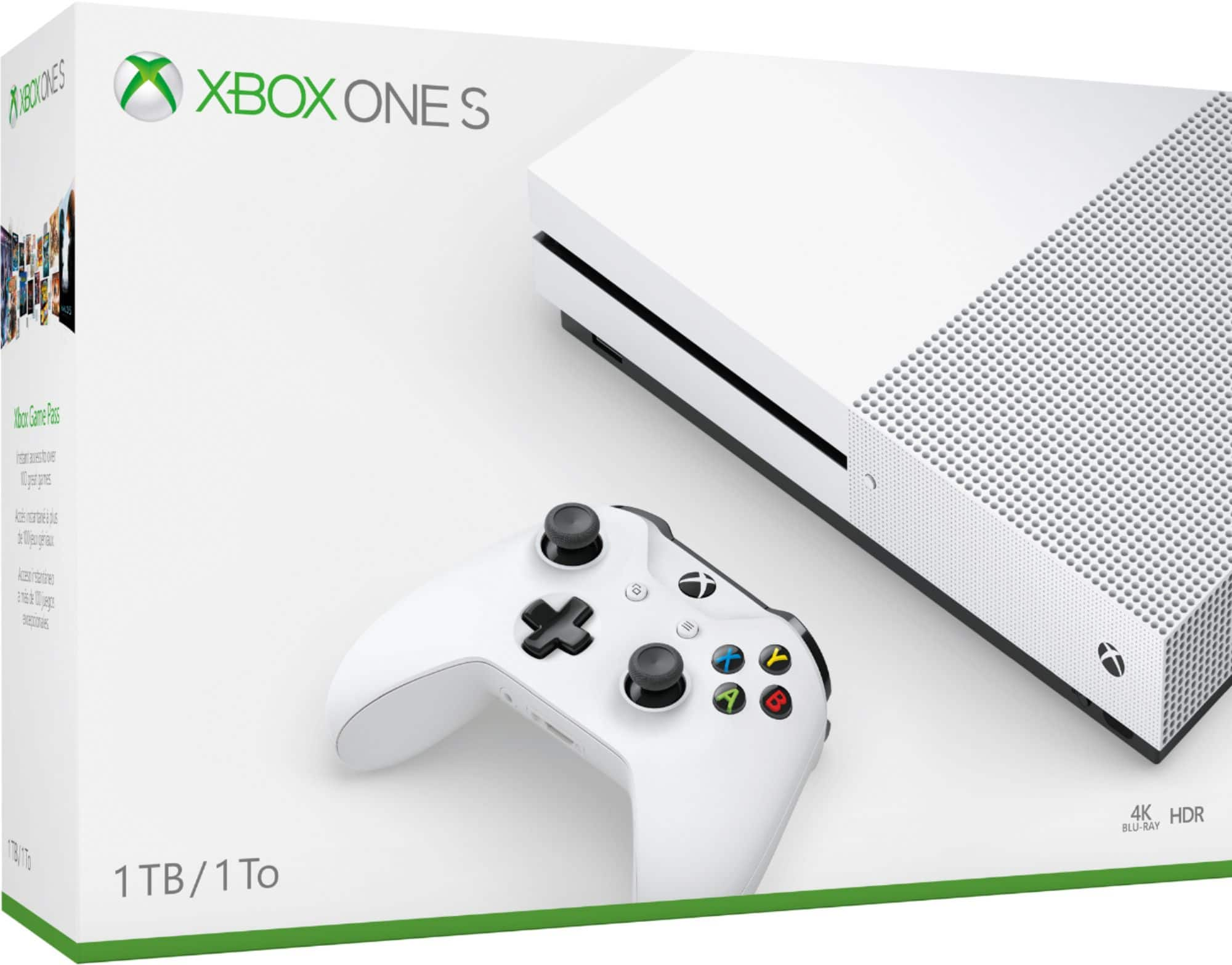
      <img alt="ONE S 1TB" class="h-full object-contain" src="https://pisces.bbystatic.com/image2/BestBuy_US/images/products/6415/6415222cv11d.jpg" />
      <img alt="Warranty" class="absolute top-2 left-2 opacity-90" src="/assets/warranty-6f2832a6.png" width="64" height="64" />
    </div>

    <!-- Info -->
    <div class="flex flex-col flex-1 p-4 gap-2">
      <p class="text-[10px] font-semibold text-green-600 dark:text-green-400 uppercase tracking-widest">XBOX</p>
      <h3 class="text-sm font-bold text-gray-800 dark:text-white leading-snug line-clamp-2">
        ONE S 1TB 1TB
      </h3>
      <p class="text-xs text-gray-400 dark:text-gray-500"></p>

      <!-- Condition badge — a grouped card (show_from) represents several
           storage/grade combinations at once, so showing just this one unit's
           grade would misrepresent the group; the price row alone with
           "From £X" carries the card instead. -->
      <div class="mt-auto pt-2 flex items-center justify-between gap-2">
          <span class="shrink-0 whitespace-nowrap text-[10px] font-semibold px-2 py-0.5 rounded-full bg-indigo-600 text-white">
            Grade A
          </span>
        <div class="flex flex-col items-end">
          <p class="text-base font-extrabold text-gray-900 dark:text-white">£100</p>
        </div>
      </div>

      <!-- Klarna pay-in-3 — its own full-width line so it never squeezes the
           grade badge or pushes the price out of a narrow card. -->
        <p class="text-[10px] leading-tight text-right text-gray-500 dark:text-gray-400">or 3 × £33.34 with <span class="font-bold text-gray-800 dark:text-gray-200">Klarna</span></p>

      <button class="mt-2 w-full bg-[rgb(0,106,58)] hover:bg-green-700 dark:bg-green-700 dark:hover:bg-green-600 text-white text-xs py-2 font-semibold rounded-xl transition-colors duration-150">
        View Details
      </button>
    </div>
  </div>
</a>
      <a class="group block" href="/mobile/1072">
  <div class="bg-white dark:bg-[rgb(0,35,20)] rounded-2xl shadow-sm hover:shadow-md dark:shadow-black/30 dark:hover:shadow-black/50 transition-all duration-200 overflow-hidden flex flex-col h-full border border-gray-100 dark:border-green-900/40 hover:border-green-200 dark:hover:border-green-700">


    <!-- Image — non-PNG device photos are hotlinked JPEGs with an opaque
         white studio background baked into the pixels (no transparency to
         blend with a dark tile), so those stay a deliberate light "photo
         mat" in both themes rather than flipping dark and clashing with
         them. PNGs are usually real cutouts with transparency and don't
         have that problem, so they keep the original theme-aware tile. -->
    <div class="relative bg-gray-50 flex items-center justify-center p-4 h-[180px]">
      <img alt="NITRO 5 GAMING" class="h-full object-contain" src="https://pisces.bbystatic.com/image2/BestBuy_US/images/products/6413/6413248cv1d.jpg" />
      <img alt="Warranty" class="absolute top-2 left-2 opacity-90" src="/assets/warranty-6f2832a6.png" width="64" height="64" />
    </div>

    <!-- Info -->
    <div class="flex flex-col flex-1 p-4 gap-2">
      <p class="text-[10px] font-semibold text-green-600 dark:text-green-400 uppercase tracking-widest">ACER</p>
      <h3 class="text-sm font-bold text-gray-800 dark:text-white leading-snug line-clamp-2">
        NITRO 5 GAMING 256GB
      </h3>
      <p class="text-xs text-gray-400 dark:text-gray-500"></p>

      <!-- Condition badge — a grouped card (show_from) represents several
           storage/grade combinations at once, so showing just this one unit's
           grade would misrepresent the group; the price row alone with
           "From £X" carries the card instead. -->
      <div class="mt-auto pt-2 flex items-center justify-between gap-2">
          <span class="shrink-0 whitespace-nowrap text-[10px] font-semibold px-2 py-0.5 rounded-full bg-indigo-600 text-white">
            Grade A
          </span>
        <div class="flex flex-col items-end">
          <p class="text-base font-extrabold text-gray-900 dark:text-white">£350</p>
        </div>
      </div>

      <!-- Klarna pay-in-3 — its own full-width line so it never squeezes the
           grade badge or pushes the price out of a narrow card. -->
        <p class="text-[10px] leading-tight text-right text-gray-500 dark:text-gray-400">or 3 × £116.67 with <span class="font-bold text-gray-800 dark:text-gray-200">Klarna</span></p>

      <button class="mt-2 w-full bg-[rgb(0,106,58)] hover:bg-green-700 dark:bg-green-700 dark:hover:bg-green-600 text-white text-xs py-2 font-semibold rounded-xl transition-colors duration-150">
        View Details
      </button>
    </div>
  </div>
</a>
      <a class="group block" href="/mobile/896">
  <div class="bg-white dark:bg-[rgb(0,35,20)] rounded-2xl shadow-sm hover:shadow-md dark:shadow-black/30 dark:hover:shadow-black/50 transition-all duration-200 overflow-hidden flex flex-col h-full border border-gray-100 dark:border-green-900/40 hover:border-green-200 dark:hover:border-green-700">


    <!-- Image — non-PNG device photos are hotlinked JPEGs with an opaque
         white studio background baked into the pixels (no transparency to
         blend with a dark tile), so those stay a deliberate light "photo
         mat" in both themes rather than flipping dark and clashing with
         them. PNGs are usually real cutouts with transparency and don't
         have that problem, so they keep the original theme-aware tile. -->
    <div class="relative bg-gray-50 flex items-center justify-center p-4 h-[180px]">
      <img alt="3S" class="h-full object-contain" src="https://pisces.bbystatic.com/image2/BestBuy_US/images/products/8e0917a8-a30f-4a72-b034-032d7f437da1.jpg" />
      <img alt="Warranty" class="absolute top-2 left-2 opacity-90" src="/assets/warranty-6f2832a6.png" width="64" height="64" />
    </div>

    <!-- Info -->
    <div class="flex flex-col flex-1 p-4 gap-2">
      <p class="text-[10px] font-semibold text-green-600 dark:text-green-400 uppercase tracking-widest">META QUEST</p>
      <h3 class="text-sm font-bold text-gray-800 dark:text-white leading-snug line-clamp-2">
        3S 128GB
      </h3>
      <p class="text-xs text-gray-400 dark:text-gray-500"></p>

      <!-- Condition badge — a grouped card (show_from) represents several
           storage/grade combinations at once, so showing just this one unit's
           grade would misrepresent the group; the price row alone with
           "From £X" carries the card instead. -->
      <div class="mt-auto pt-2 flex items-center justify-between gap-2">
          <span class="shrink-0 whitespace-nowrap text-[10px] font-semibold px-2 py-0.5 rounded-full bg-indigo-600 text-white">
            Grade A
          </span>
        <div class="flex flex-col items-end">
          <p class="text-base font-extrabold text-gray-900 dark:text-white">£235</p>
        </div>
      </div>

      <!-- Klarna pay-in-3 — its own full-width line so it never squeezes the
           grade badge or pushes the price out of a narrow card. -->
        <p class="text-[10px] leading-tight text-right text-gray-500 dark:text-gray-400">or 3 × £78.34 with <span class="font-bold text-gray-800 dark:text-gray-200">Klarna</span></p>

      <button class="mt-2 w-full bg-[rgb(0,106,58)] hover:bg-green-700 dark:bg-green-700 dark:hover:bg-green-600 text-white text-xs py-2 font-semibold rounded-xl transition-colors duration-150">
        View Details
      </button>
    </div>
  </div>
</a>
      <a class="group block" href="/mobile/873">
  <div class="bg-white dark:bg-[rgb(0,35,20)] rounded-2xl shadow-sm hover:shadow-md dark:shadow-black/30 dark:hover:shadow-black/50 transition-all duration-200 overflow-hidden flex flex-col h-full border border-gray-100 dark:border-green-900/40 hover:border-green-200 dark:hover:border-green-700">


    <!-- Image — non-PNG device photos are hotlinked JPEGs with an opaque
         white studio background baked into the pixels (no transparency to
         blend with a dark tile), so those stay a deliberate light "photo
         mat" in both themes rather than flipping dark and clashing with
         them. PNGs are usually real cutouts with transparency and don't
         have that problem, so they keep the original theme-aware tile. -->
    <div class="relative bg-gray-50 flex items-center justify-center p-4 h-[180px]">
      <img alt="3S" class="h-full object-contain" src="https://pisces.bbystatic.com/image2/BestBuy_US/images/products/8e0917a8-a30f-4a72-b034-032d7f437da1.jpg" />
      <img alt="Warranty" class="absolute top-2 left-2 opacity-90" src="/assets/warranty-6f2832a6.png" width="64" height="64" />
    </div>

    <!-- Info -->
    <div class="flex flex-col flex-1 p-4 gap-2">
      <p class="text-[10px] font-semibold text-green-600 dark:text-green-400 uppercase tracking-widest">META QUEST</p>
      <h3 class="text-sm font-bold text-gray-800 dark:text-white leading-snug line-clamp-2">
        3S 128GB
      </h3>
      <p class="text-xs text-gray-400 dark:text-gray-500">GAMING</p>

      <!-- Condition badge — a grouped card (show_from) represents several
           storage/grade combinations at once, so showing just this one unit's
           grade would misrepresent the group; the price row alone with
           "From £X" carries the card instead. -->
      <div class="mt-auto pt-2 flex items-center justify-between gap-2">
          <span class="shrink-0 whitespace-nowrap text-[10px] font-semibold px-2 py-0.5 rounded-full bg-indigo-600 text-white">
            Grade A
          </span>
        <div class="flex flex-col items-end">
          <p class="text-base font-extrabold text-gray-900 dark:text-white">£249</p>
        </div>
      </div>

      <!-- Klarna pay-in-3 — its own full-width line so it never squeezes the
           grade badge or pushes the price out of a narrow card. -->
        <p class="text-[10px] leading-tight text-right text-gray-500 dark:text-gray-400">or 3 × £83 with <span class="font-bold text-gray-800 dark:text-gray-200">Klarna</span></p>

      <button class="mt-2 w-full bg-[rgb(0,106,58)] hover:bg-green-700 dark:bg-green-700 dark:hover:bg-green-600 text-white text-xs py-2 font-semibold rounded-xl transition-colors duration-150">
        View Details
      </button>
    </div>
  </div>
</a>
      <a class="group block" href="/mobile/334">
  <div class="bg-white dark:bg-[rgb(0,35,20)] rounded-2xl shadow-sm hover:shadow-md dark:shadow-black/30 dark:hover:shadow-black/50 transition-all duration-200 overflow-hidden flex flex-col h-full border border-gray-100 dark:border-green-900/40 hover:border-green-200 dark:hover:border-green-700">


    <!-- Image — non-PNG device photos are hotlinked JPEGs with an opaque
         white studio background baked into the pixels (no transparency to
         blend with a dark tile), so those stay a deliberate light "photo
         mat" in both themes rather than flipping dark and clashing with
         them. PNGs are usually real cutouts with transparency and don't
         have that problem, so they keep the original theme-aware tile. -->
    <div class="relative bg-gray-50 flex items-center justify-center p-4 h-[180px]">
      <img alt="SWITCH LITE" class="h-full object-contain" src="https://pisces.bbystatic.com/image2/BestBuy_US/images/products/6514/6514550cv14d.jpg" />
      <img alt="Warranty" class="absolute top-2 left-2 opacity-90" src="/assets/warranty-6f2832a6.png" width="64" height="64" />
    </div>

    <!-- Info -->
    <div class="flex flex-col flex-1 p-4 gap-2">
      <p class="text-[10px] font-semibold text-green-600 dark:text-green-400 uppercase tracking-widest">NINTENDO</p>
      <h3 class="text-sm font-bold text-gray-800 dark:text-white leading-snug line-clamp-2">
        SWITCH LITE STANDARD
      </h3>
      <p class="text-xs text-gray-400 dark:text-gray-500">GAMING</p>

      <!-- Condition badge — a grouped card (show_from) represents several
           storage/grade combinations at once, so showing just this one unit's
           grade would misrepresent the group; the price row alone with
           "From £X" carries the card instead. -->
      <div class="mt-auto pt-2 flex items-center justify-between gap-2">
          <span class="shrink-0 whitespace-nowrap text-[10px] font-semibold px-2 py-0.5 rounded-full bg-indigo-600 text-white">
            Grade A
          </span>
        <div class="flex flex-col items-end">
          <p class="text-base font-extrabold text-gray-900 dark:text-white">£89</p>
        </div>
      </div>

      <!-- Klarna pay-in-3 — its own full-width line so it never squeezes the
           grade badge or pushes the price out of a narrow card. -->
        <p class="text-[10px] leading-tight text-right text-gray-500 dark:text-gray-400">or 3 × £29.67 with <span class="font-bold text-gray-800 dark:text-gray-200">Klarna</span></p>

      <button class="mt-2 w-full bg-[rgb(0,106,58)] hover:bg-green-700 dark:bg-green-700 dark:hover:bg-green-600 text-white text-xs py-2 font-semibold rounded-xl transition-colors duration-150">
        View Details
      </button>
    </div>
  </div>
</a>
  </template>
</turbo-stream>


<turbo-stream action="replace" target="load_devices"><template>
    <div class=""></div>  
</template></turbo-stream>